Tue, June 21, 2005
Thinking About Photo Galleries—4:14 PM
Today, Jason Kottke (the Internet's most famous full-time blogger) announced the redesign of his site's photo album feature.
Tweaked photo album template [Kottke]
Kottke has ripped off (sorry, "adopted") the same navigation that I adopted (sorry, "stole") from Doug Bowman's galleries.
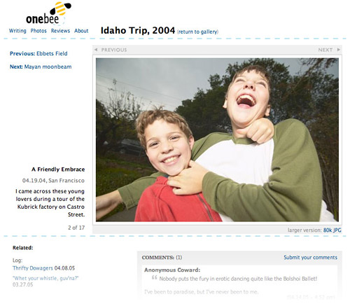
If you mouseover the right half of the photo, you get an arrow overlaid on the photo that suggests that you can click to move to the next photo (which, of course, you can). Then you can click on the left side of the photo to go back.
My photo pages will do the same thing. You can't see it in the mockup, because it's just a static image, but the "previous" and "next" buttons atop every picture light up when you mouseover a) that half of the image, b) the buttons themselves, or c) the text links at the left which relate to the next and previous photos. Doug's gallery was the first place I'd ever seen this, and I think it's brilliant.
First of all, it's basic Fitts's law – giving people a larger area to click makes the photo gallery that much easier to navigate. And, giving a visual indicator helps viewers learn how to use the page. At first, they might be clicking on the text links, but after seeing the "next" button light up every time, they'll adapt to the easier way. It's the only place onebee will feature rollover graphics – which I did away with in last year's redesign – but I think it's a worthy exception to the rule.
Kottke chose to follow Doug's lead and also superimpose the navigation arrows right on the image:
If you're using Safari or Firefox or anything but IE really, the arrow images are tranparent png files that blend in with the photo in the background. Fun!
This is one of the reasons I chose to put my buttons outside the image: compatibility. Even a feature as simple as this will start to break in older browsers, and I wanted to preserve the full functionality for as many viewers as possible. Also, this will allow me to keep the size and placement of the buttons consistent even if the photo isn't always the same size – and that's another win for usability. The overlay effect is very pretty, but I like that my version will be more inclusive and easier to use – plus, you can keep your pointer over the right half of the photo the whole time you're navigating the gallery, and always be able to see the unobstructed image.
It's great fun to work through these design and usability challenges, and it's cool when others are in the same boat – fishing around for the best possible solution. Kottke and Doug Bowman were the inspiration for my ground-up redesign of the way photos will be treated at onebee: bigger images, easier navigation, friendlier layouts. I can't wait for the new onebee, when we'll all be able to use them.
Update: An example of what not to do: John Kerry's Challenge – could those navigation buttons be any smaller and harder to find?

