Mon, April 18, 2005
Fill your day with Picture Pages!—7:51 PM
For those of you knuckleheaded enough to be considering a future in web design, this ought to be enough to slap that notion out of your minds! I spent the entire day working on this one page (minus the hours from 8-6 when I was diligently working at my day job, of course!). And that's just the layout – I won't tie it into the database until a few weeks from now when I've built the new photo management tools. Plus there's a gallery page that needs to be laid out, too – although fortunately that layout is pretty similar to this one.
I'm really delighted with the final product, though, and I hope you will be, too, when it's time to start showing photos in it. As with the other major sections of this redesign, I'm hoping that having a proper venue for showing pictures means I'll take more and share more.
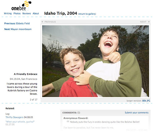
In keeping with our new "Love all. Serve all. Show all." philosophy, here's what the new photo pages will look like once the redesign is through.
The idea of the redesigned photo pages is to devote as much of the screen to the photo display as possible, while making it super-easy to navigate through the gallery to the next picture, or back to the last one. As usual, I'm standing on the shoulders of giants, here – incorporating the concept of clicking half of the image to navigate forward (and the other half, back) which comes from kottke.org and Doug Bowman's StopDesign. (It's an idea well worth borrowing – it's simple Fitts's Law, adding such a big click target makes a huge difference when navigating a photo gallery.) Of course I've added a few tweaks of my own, to make a better fit with onebee – and, wouldn't you know, those tweaks were the most maddening part of today's ordeal.
I have to agree with the 37signals folks, though. Typically, I would have mocked this page up in Photoshop before coding it in HTML and CSS, but today I followed their credo of "Get real fast," and went straight from pencil sketches to code, and it was grueling but it gave me a better idea of what was possible, and allowed me to turn things on and off to show how the page will look in different states (gallery vs. standalone photo; larger version available vs. not; horizontal vs. vertical). Their essay on patterns in web design was a big help too. Is there anything they can't do?


Bee Boy — Fri, 8/22/08 8:18pm
I still love that I once thought of this as devoting "as much of the screen to the photo display as possible." Admittedly, the revised photo pages could still be wider – at some point it's a judgment call about how large a file you want to load and what size most of your pictures will be anyway. But, looking at that mockup, it seems like there's a fair amount of possible photo display area on the left-hand side.
It also amazes me that it was less than four years ago. It's fun to reread and remember how excited I was about web design back then. Not that I hate it these days, but I rarely approach it with the sort of saucer-eyed enthusiasm I had that summer.